August 29, 2024
The Impact of Color Schemes on Customer Behavior in Retail Stores
Table of Contents
-
The Psychological Impact of Colors
-
Warm Colors
-
Cool Colors
-
Neutral Colors
-
-
Color Schemes and Their Effects
-
Monochromatic Schemes
-
Complementary Schemes
-
Analogous Schemes
-
-
Strategies for Applying Color in Retail Stores
-
Highlighting Products
-
Creating Atmosphere
-
Guiding Customer Flow
-
-
Considerations for Different Retail Environments
-
Fashion and Apparel
-
Food and Beverage
-
Technology and Electronics
-

The Psychological Impact of Colors
Warm Colors
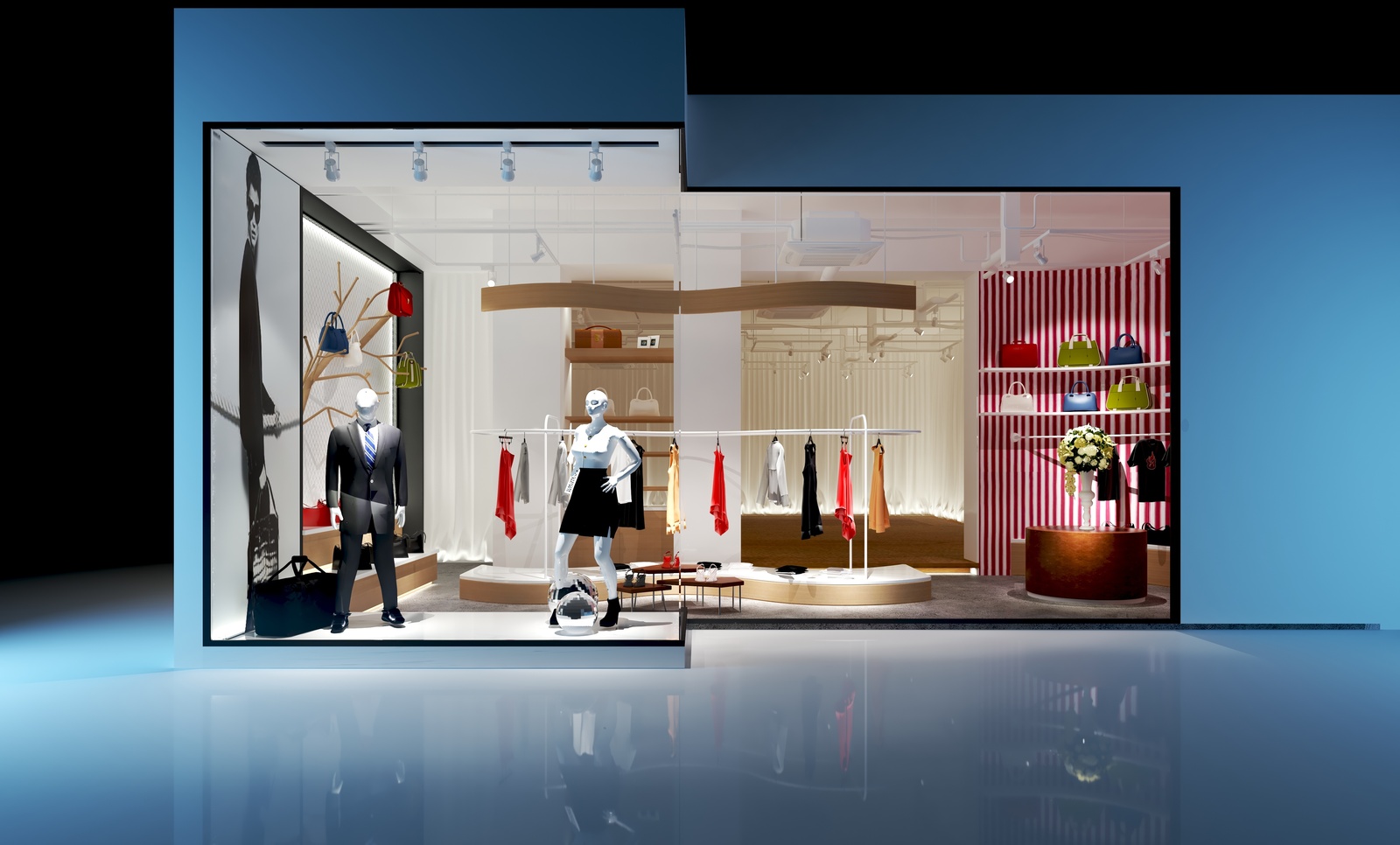
Warm colors such as red, orange, and yellow are known to evoke feelings of energy, excitement, and urgency. They can stimulate appetite and impulse buying, making them ideal for attracting attention to sales or promotional areas.
Cool Colors
Cool colors like blue, green, and purple are calming and soothing. They evoke a sense of trust, reliability, and serenity. Cool colors are often used in areas where customers spend more time, such as fitting rooms or lounging areas, to create a relaxing atmosphere.
Neutral Colors
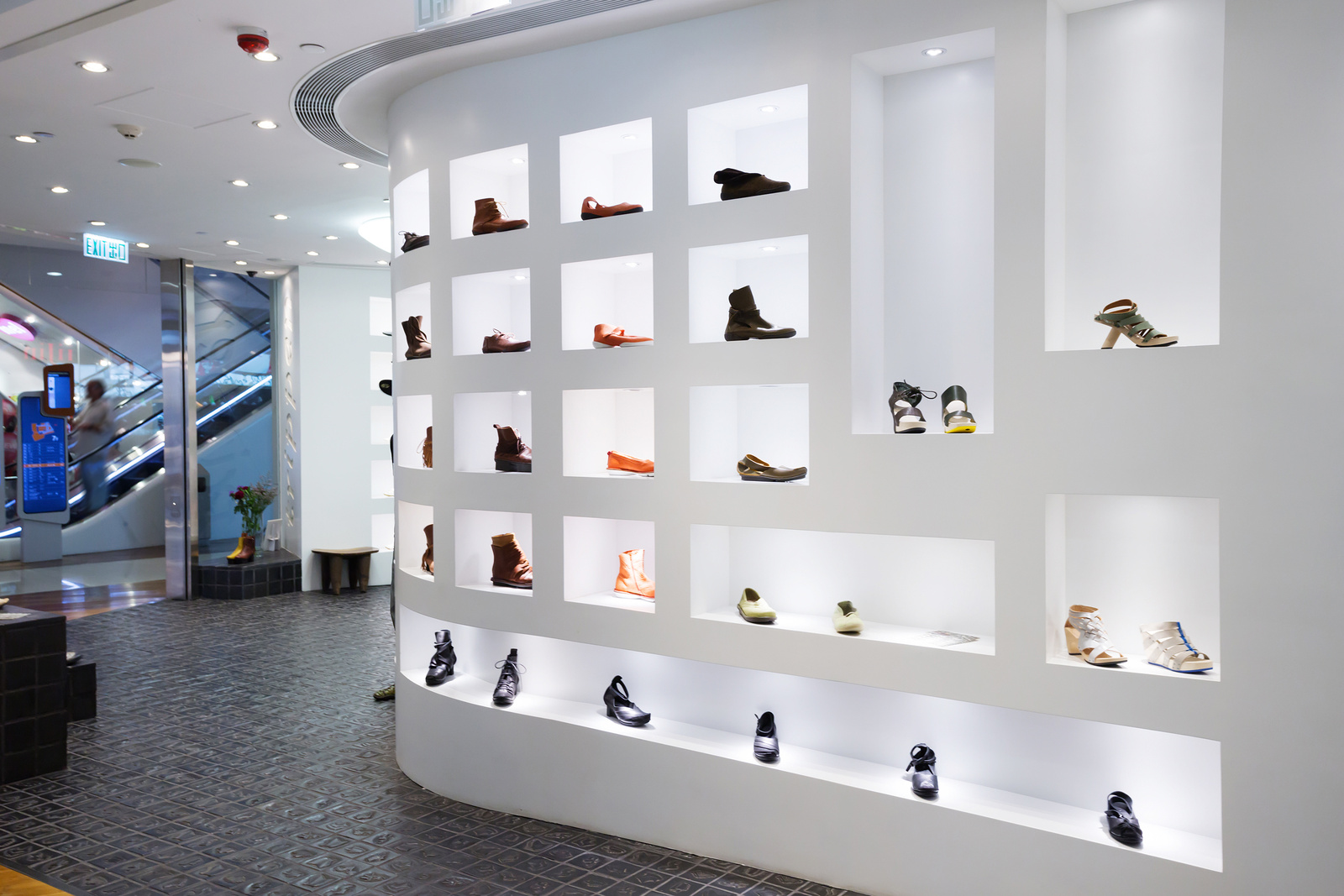
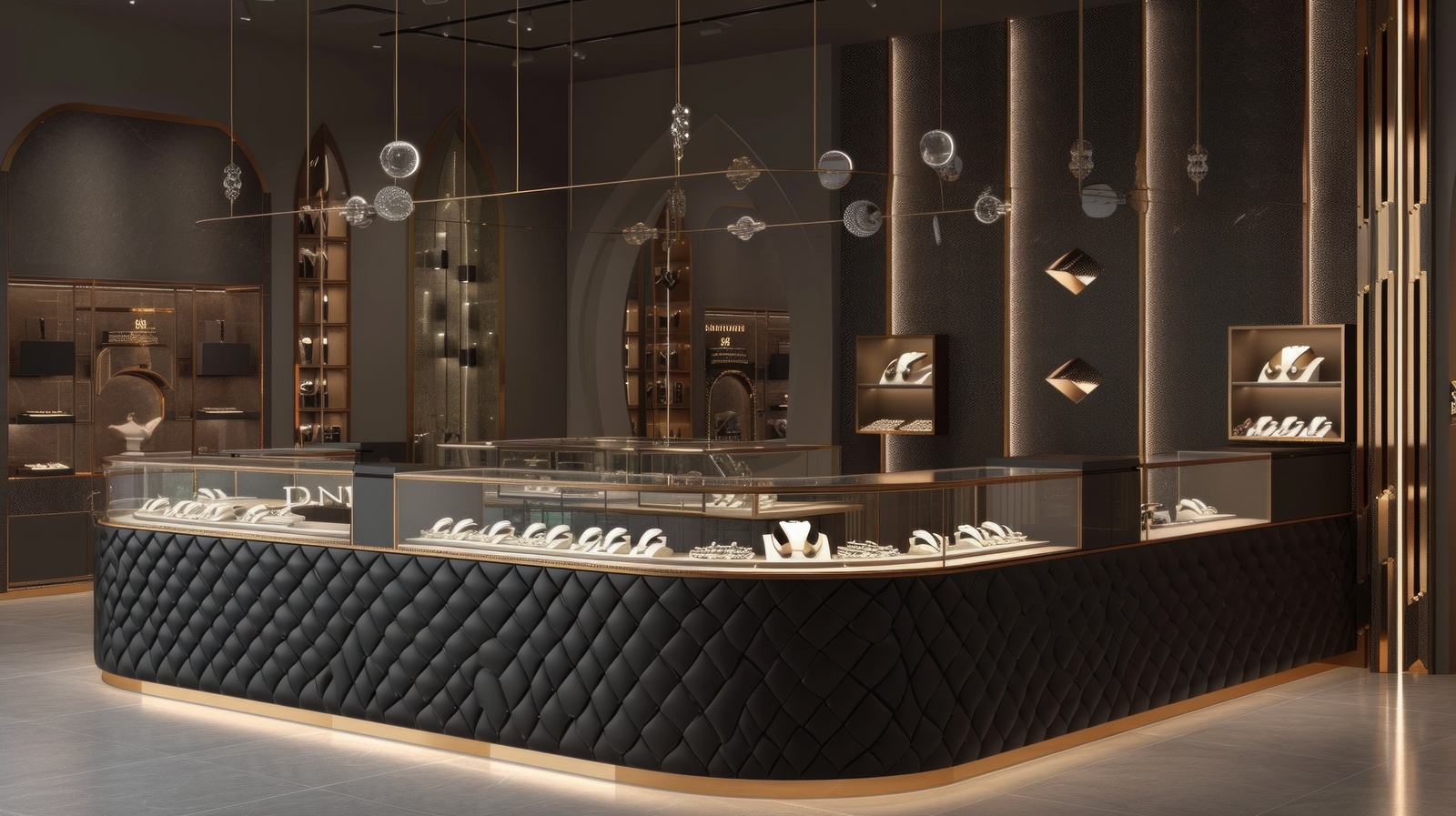
Neutral colors such as white, gray, and beige provide a sense of simplicity, elegance, and sophistication. They serve as a versatile backdrop for highlighting products and complementing other colors without overwhelming the space.

Color Schemes and Their Effects
Monochromatic Schemes
Monochromatic color schemes use variations of a single color, creating a harmonious and cohesive look. They can create a sense of elegance and simplicity, ideal for luxury or high-end retail environments.
Complementary Schemes
Complementary color schemes use colors that are opposite each other on the color wheel (e.g., blue and orange, red and green). They create contrast and visual interest, making products stand out and attracting attention.
Analogous Schemes
Analogous color schemes use colors that are adjacent to each other on the color wheel (e.g., blue, green, and teal). They create a harmonious and unified look, suitable for creating a calming or cohesive atmosphere.
Strategies for Applying Color in Retail Stores
Highlighting Products
Use contrasting colors to highlight key products or promotions. For example, placing red signage against a neutral background can draw attention and create a sense of urgency.
Creating Atmosphere
Choose colors that align with the desired atmosphere of the store. Warm colors can energize a space, while cool colors can promote relaxation and browsing.
Guiding Customer Flow
Use color to guide customers through the store. Bright colors can attract attention to entrances or specific departments, while softer colors can encourage exploration in quieter areas.

Considerations for Different Retail Environments
Fashion and Apparel
Fashion retailers often use vibrant colors to reflect current trends and evoke excitement. Neutral backgrounds allow clothing colors and textures to stand out, facilitating easier decision-making for customers.
Food and Beverage
Food retailers use appetizing colors like reds, oranges, and yellows to stimulate appetite. Clean, fresh colors like green and white convey healthiness and cleanliness, enhancing the appeal of food products.
Technology and Electronics
Technology stores often use sleek, modern color palettes with cool tones to convey innovation and sophistication. Accent colors may be used to highlight the latest products or promotions.